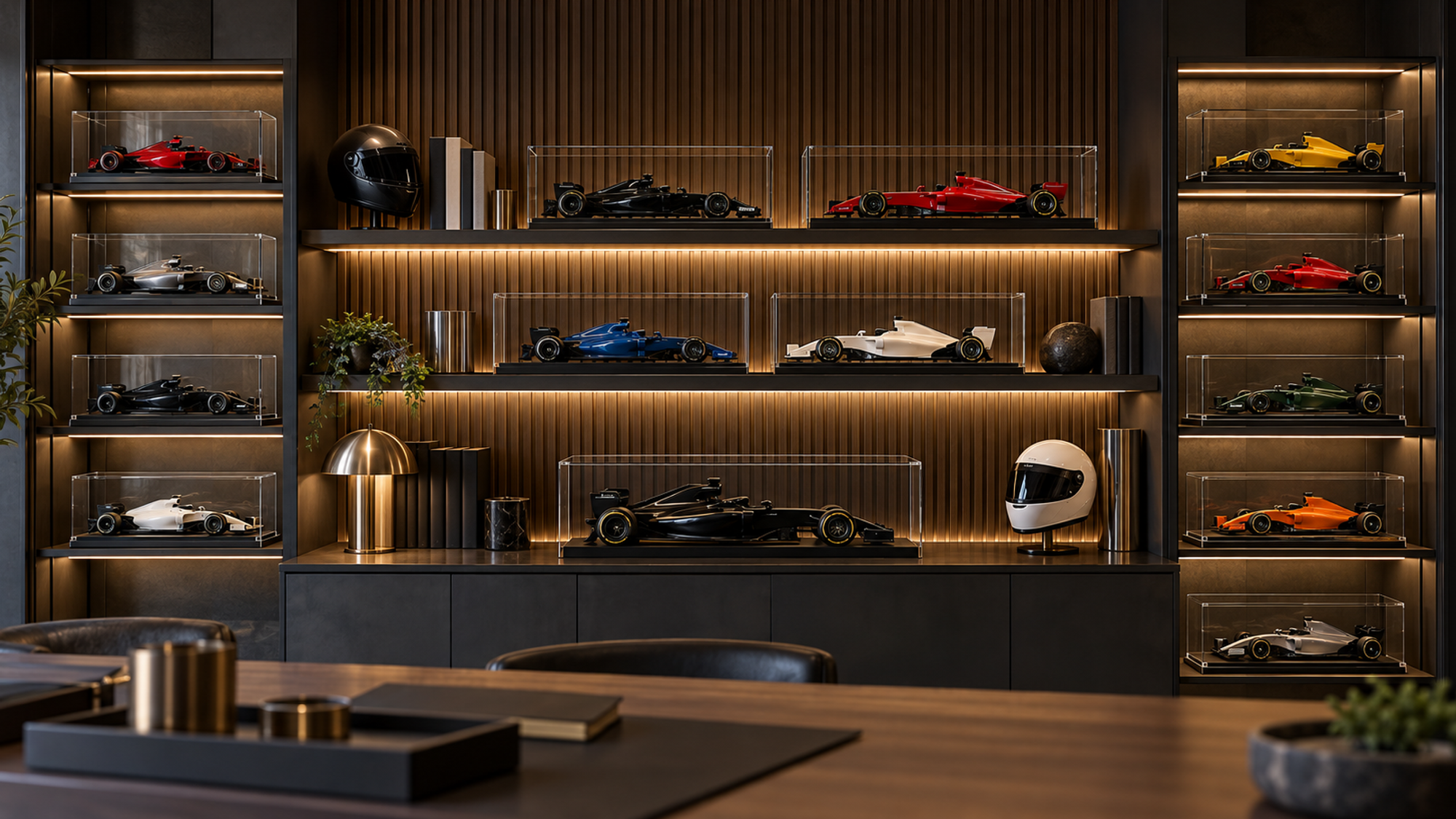
There is a version of the Formula 1 room that works in a house where adults live. It exists, it is not a compromise, and it does not involve hiding the fact that you like motorsport.
It mostly involves owning fewer things and lighting them properly.
Why most racing rooms fail
Four failure modes, and almost every disappointing motorsport room has at least three of them.
Quantity instead of composition. The instinct is that if one object expresses enthusiasm, twelve express it more. It works in the opposite direction. Twelve objects on a wall stop being twelve objects and become texture — a busy surface the eye slides across without stopping anywhere. One object, correctly placed and lit, holds attention. Twelve hold none.
Team-colour saturation. Painting a wall Ferrari red, then hanging red things on it, then adding a red rug. Saturated colour is exhausting at architectural scale, and it removes any possibility of the objects standing out — a red car against a red wall has nowhere to go.
Poster-shop lighting. A single ceiling light, straight down, at whatever colour temperature the bulb happened to be. Flat, shadowless, and unkind to every surface in the room.
No negative space. Every wall used, every shelf full, nothing left empty. Emptiness is not wasted space. It is the thing that makes occupied space read as deliberate.
The good news is that all four are cheap to fix, and three of them involve removing rather than buying.
Palette: one accent, one neutral field
The professional approach to a themed room is almost the reverse of the amateur one. Rather than filling the room with the theme, you build a quiet field and let the theme be the loudest thing in it.
Keep the walls neutral. Warm white, soft grey, off-black. Deep charcoal is particularly good behind display objects — it recedes visually and makes colour pop without competing.
Let one livery be the accent. If your collection is Ferrari, the red should come from the objects and perhaps one small textile. Not from the wall. A red car on a charcoal wall is a red car. A red car on a red wall is a texture.
The 60-30-10 rule applies here as anywhere. Roughly 60% neutral field, 30% secondary tone, 10% accent. Motorsport rooms typically run at something like 20-20-60, which is why they feel loud.
One metal. Frames, lamp, shelf brackets, hardware — pick brushed aluminium or black or brass and stay with it. Mixed metals read as accumulation.
Zoning: decide where the eye lands first
A room needs a hierarchy. Without one, everything competes.
Establish a single focal wall. One wall carries the display. The others stay quiet — one piece of art at most, or nothing. This is the discipline that separates a designed room from a themed one.
Keep the working surface clear. If there is a desk, it is a desk. The temptation to line the back edge with models is strong and should be resisted; it puts objects in your peripheral vision all day, where they become invisible, and it makes the desk unusable.
One object at seated eye level. Wherever the seating is, there should be exactly one thing directly in the sightline. That is the room's anchor.
Storage is part of the design. Which brings us to the rule that does the most work.
The editing rule: display 30%, rotate the rest
This is the single most valuable piece of advice in this article and the one nobody wants to hear.
Curate your display down to roughly the best third of what you own. Store the rest properly — boxed, dark, stable humidity — and rotate every few months.
Three things happen. The displayed objects get the space and light they need to actually be seen. The room stops reading as storage. And you rediscover your own collection several times a year instead of gradually ceasing to notice any of it.
It also solves the growth problem. A collection that grows does not require a room that grows; it requires a rotation.
The objection is that you want to see everything you own. In practice, in a crowded room, you see none of it. Density is not visibility.
Lighting properly
Cheapest meaningful improvement available. Most motorsport rooms are lit like storage rooms.
Colour temperature: 3000K to 4000K. 3000K reads warm and domestic; 4000K reads neutral and slightly technical, which suits a display of engineering objects. Both are fine. Avoid 6000K and above — it makes reds go pink, turquoise go grey, and gives everything a showroom flatness.
Layer three sources. Ambient for the room, accent for the display, task for whatever you actually do in there. A room with one light source has one mood; a room with three has as many as you want.
Wash the display wall, do not spot it. A linear source above the wall raking down across it gives even light, a single consistent shadow direction, and reveals surface form. Individual spots give hot spots and competing shadows.
Put everything on a dimmer. A display you can turn down is a display you will live with rather than perform.
Watch the daylight. Note where the sun falls at different times. This is an aesthetic question and also a preservation one — direct sunlight yellows ABS and fades paint permanently. Detail in Dust, UV and Fingerprints.
Mixing media
A wall of the same kind of object reads as a shop display. Variety in type, discipline in quantity, is the balance.
A ratio that works for a single wall:
- Two to four framed models. The anchor. Consistent frames, consistent spacing — layouts here.
- One printed piece. A circuit map, a technical drawing, a single good photograph. Provides a flat plane against the three-dimensional objects.
- One functional object. A keyholder, a clock, something used rather than displayed. It keeps the wall from reading as a museum vitrine.
- One shelf, sparsely occupied. Three models at most, with space around them.
Note what is not on that list: nothing at multiple scales adjacent, nothing in a second frame style, no clusters of small items. Detail on scale mixing is in the scale guide.
The small-space version
Most people do not have a dedicated room, and the principles compress well.
One wall in a flat. Two frames at eye level, one small light above, nothing else on that wall. That is a complete, finished motorsport display, and it will look better than most dedicated rooms.
Above a desk. A single frame, centred, 25–30cm above the desk surface. One model on the desk, not five. The frame does the expressive work; the desk stays a desk.
A rental with no drilling. A narrow picture ledge held with a tension system, or a leaning frame on a sideboard. Accept the constraint rather than trusting adhesive with a kilogram of model.
A shared living room. This is where restraint pays off most. Two frames in a neutral palette, well lit, read to a non-enthusiast as design objects rather than as fan merchandise — which is the difference between a display that is tolerated and one that is admired.
Three rooms, with lists
[VERIFY: this section needs a real shoot. The written version below is the specification for the photography, not a substitute for it.]
Room one — one wall in a flat. Charcoal wall, two frames at 135cm centre line with 14cm between, linear LED wash at 3500K on a dimmer. Total object count: two.
Room two — home office. Warm white walls, one frame centred above the desk, one printed technical drawing on the adjacent wall, one keyholder by the door, one model on a floating shelf. Desk lamp at 4000K. Total object count: five, across three walls.
Room three — dedicated room. Charcoal focal wall with a 2×2 frame grid, opposite wall neutral and near-empty, one sparse shelf with three 1:18 models, seating facing the grid. Three-layer lighting, all dimmable. Approximately 60% of the collection in storage on rotation.
Shot list required: each room in daylight and in evening light; one detail shot per room; 6–8 vertical crops for Pinterest. [VERIFY: budget and book this before the publish date — the article does not work as text alone.]
Start with one wall
Do not plan the whole room. Do one wall properly — neutral field, two objects, one good light — and live with it for a month.
You will learn more about what your specific room needs from that than from any amount of planning, and you will not have spent money on the things you would otherwise have bought and later removed.
**Next: multi-frame layouts · choosing your scale · **why the wall, not the shelf